We are pleased to present to you a short but valuable release with several user interface improvements!
You can also watch our video review of this release update:
Improvements 🌟
Fewer extra actions in the candidate walkthrough
Do you find it irritating that after approving a candidate for the next stage, you have to hide the approved stage and then unfold a new stage all by yourself? We took care of it and now you don’t need to worry.
When the stage is approved, it will be hidden afterward and the next stage will unfold automatically. No more additional efforts are required, isn’t that awesome?
Improved profile view depending on the role access
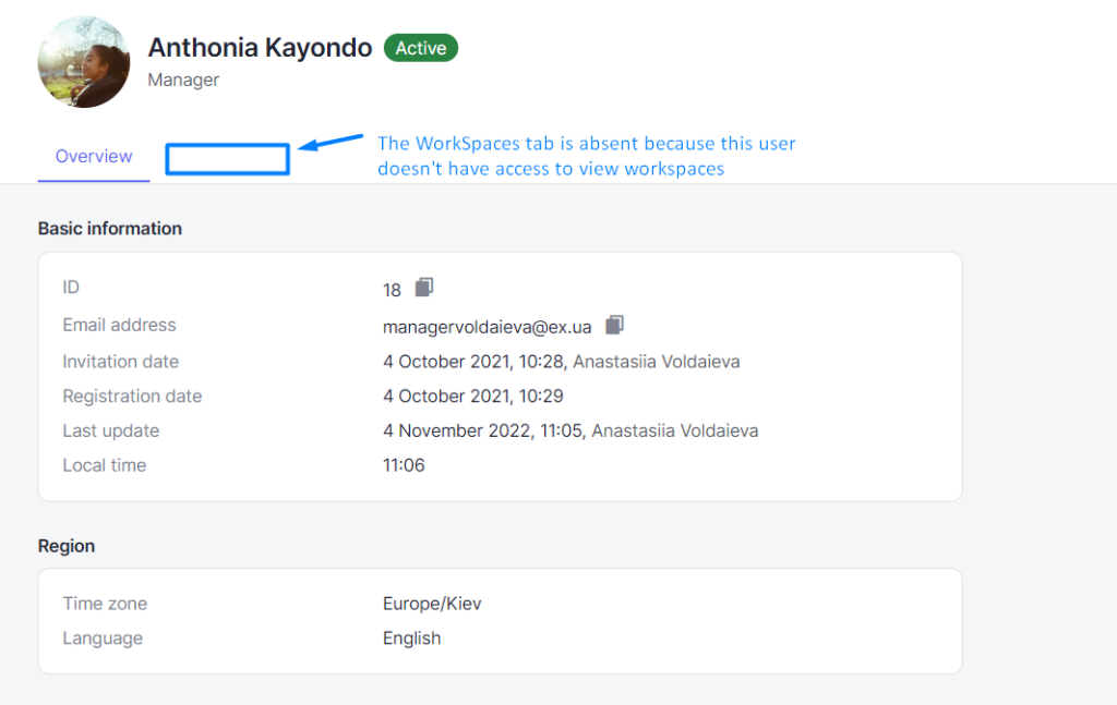
If your role doesn’t have access to viewing certain objects like a list of workspaces or users, you won’t see a tab with the corresponding list in the object profiles.

View the latest updates on your objects directly from the list
We have added a “Last update” column to the list of vacancies, requisitions, and users so that you can see when your objects were updated without opening their profiles.
Active walkthroughs will be more visible
Walkthrough cards in the “In progress” and “Hired” statuses will be colored yellow and green, respectively, and inactive walkthroughs will have a gray background. This will help you not get confused among the many walkthroughs of the candidates and quickly understand where to click.
Added “Telegram” option in candidate’s social networks
From now on, you can select “Telegram” when adding social networks of your candidates in addition to other options at your disposal.
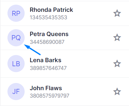
Changed the display of candidate and user avatars
The avatars will look more stylish and match our refreshed design.

Bug fixes 🔧
Fixed bugs with the time spent on stage
There were several bugs with the incorrect display of the time your candidates spent on the stage, especially if they were on Hold. Now, these bugs are fixed and the time is displayed as intended.